|
Markus Hunner |
Gregor Redinger |
In our Project we have the goal to visualize the step-by-step functioning of different clustering algorithms. The algorithms we will analyze are K-means, DBSCAN and OPTICS. There already exist several visualizations of some of these algorithms on the web. For example:
While those visualizations provide a good explanation of the abstract workings of those clustering algorithms (e.g. assigning points to clusters, recalculating the cluster centers, reassigning points ...) they don't provide a clear visualizations of the concrete step-by-step operations the algorithm performs to achieve its results. A good example of "showing but not explaining" is the visualization of DBSCAN by Naftali Harris: While this visualization clearly indicates the use of "range queries" by drawing colored circles for every performed operation on a given point the viewer is not able to understand what a range query is and how it is calculated without consulting a textual description of the algorithm. The whole visualization seems more like a explanatory video for whích the user is able to choose from several different starting conditions. Additionally the provided visualizations for the K-means algorithm don't dive into the details of different initialization or update strategies. Both of which are implementation details, that can impact the performance and result quality of K-means in a significant way.
The audience of already existing visualization examples seem to be users, who have already read about the workings and implementation specifications of the discussed algorithms, but have a hard time understanding the abstract concepts behind the performed calculations.
Our goal is to provide visualizations, that should ideally enable a user without prior knowledge of the algorithms to implement them after interacting with our application. For this it is necessary to shift the focus away from the abstract concepts of the algorithms and visualize them step-by-step for small datasets. In contrast to existing visualizations all steps taken by the algorithms have to be made explicit to the user. Therefore we aim to provide a visualization much more like the exercises used to teach those algorithms to students, than a video-like representation of their abstract concepts.
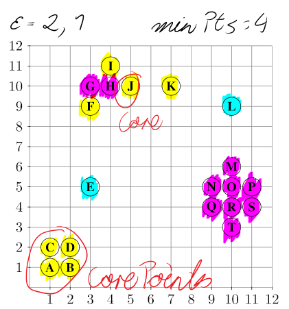
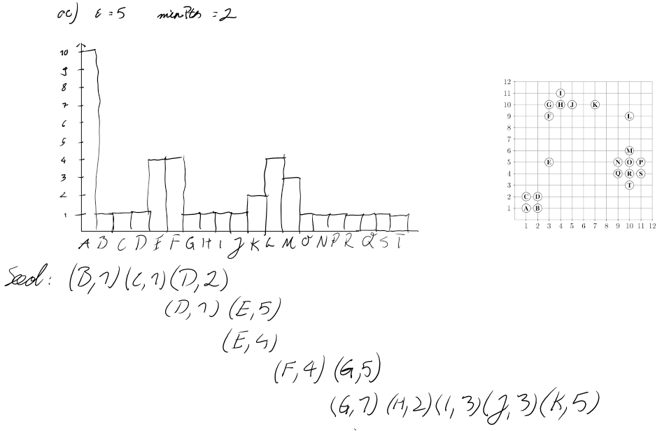
In the course 052813 Scientific Data Management the suggested algorithms where taught by "schreibtischlauf"-assignments; Which means to run through the algorithm on a piece of paper by hand.
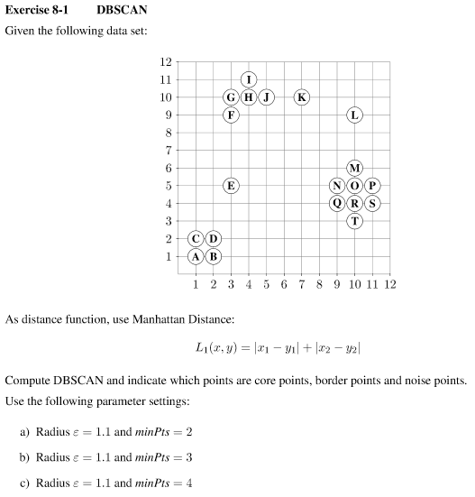
For this it is necessary to visualize the algorithms using much less datapoints than used by the already existing visualizations. Ideally a user should be able to "calculate" the next step mentally and instantly verify their proposed solution by clicking a "Next Step"‑button. This also requires the usage of a distance measure, which can be interpreted by a user without doing calculations by hand. Like shown in Fig1. the manhatten distance was used in the course Scientific Data Management, enabling students to measure the distance between two points by counting the gridlines between them.
Another advantage of using a smaller set of data points is that the exercise can easily be edited by a user. By allowing editing the initial state with mouse interactions - e.g. clicking the gridlines of the coordinate system to add or remove points - a user can come up with their own exercise, breaking and creating new clusters with just a few mouse clicks. Showing the current dataset in json format using a textarea could enable users to easily share their generated exercises.
Additionally we would like to explore fitting and detailed visualizations for the range queries used in DBSCAN and Optics. Something existing visualizations seem to be lacking.

Our overall goal is to perform a Design study by implementing a visualization that improves on already existing visualizations of clustering algorithms and provides a way to understand those algorithms by "follow-along-exercises" without the need to study their implementation details beforehand. To achieve this we aim to solve the following tasks:
Achieving those goals should result in "exercise-like" visualizations of clustering algorithms, that make every small step the algorithm performs explicit and thus can explain the algorithms in detail without requiring prior knowledge of the user or an excessive amount of textual explanation.
An additional goal to aim for - provided enough time - could be to expand the application for DBSCAN and/or OPTICS to be a true interactive version of the pen-and-paper of exercises of the course Scientific Data Management, allowing the user to propose a next step - e.g. marking a point as "core point", "reachable" or "noise point" for DBSCAN or adding a bar to the OPTICS histogram - and to get instant feedback if their choice was correct or wrong.