Link to this website:
https://gregorredinger.github.io/vis_clustering_algorithms/index.html
|
Markus Hunner |
Gregor Redinger |
M1 - first version of project proposal
In our Project we have the goal to provide a visualization for the OPTICS Clustering Algorithm.
For a short introduction to the OPTICS algorithm see:
OPTICS algorithm - From Wikipedia, the free encyclopedia
The OPTICS algorithm was first published in:
Mihael Ankerst, Markus M. Breunig, Hans-Peter Kriegel, Jörg Sander: "OPTICS: Ordering Points To Identify the Clustering Structure." ACM SIGMOD international conference on Management of data. ACM Press. pp. 49–60. (1999)
The paper can be found online at:
http://www.dbs.informatik.uni-muenchen.de/Publikationen/Papers/OPTICS.pdf
There hardly exist in-depth visualizations for the OPTICS Algorithm despite the extensive referring to visualization in "OPTICS: Ordering Points To Identify the Clustering Structure". Most of the visualizations we found are static depictions of clustering results, for the most part inspired by figures used for explaining the algorithm in the paper.
Example of interactive visualization of the Algorithm:
OPTICS builds upon an extension of the DBSCAN algorithm and is therefore part of the family of hierarchical clustering algorithms. It should be possible to draw inspiration from well established visualization techniques for DBSCAN and adapt them for the use with OPTICS.
Our goal is to provide visualizations, that should ideally enable a user without prior knowledge of the algorithms to use it with input data provided by them. It should be possible to compare clustering results with several different combination of starting parameters with each other. Different visualizations should allow for a clear understanding of the achieved results.
In the course 052813 Scientific Data Management OPTICS was taught by "schreibtischlauf"-assignments; Which means to run through the algorithm on a piece of paper by hand.
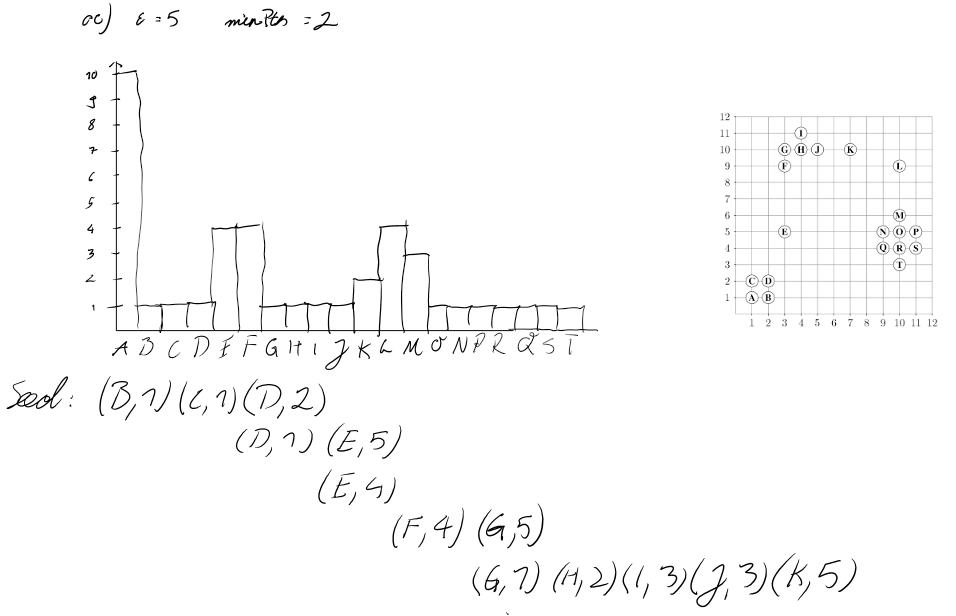
This reachability plot in the form of a histogram is one way of visualizing the results of the OPTICS algorithm with strong reference to the datastructure operations used by the implementation of the algorithm.
Our overall goal is to perform a Design study by implementing a visualization that improves on already existing visualizations of clustering algorithms and provides a way to interact with calculated clustering results through the meaningful combination of different visual representations of input and output data. To achieve this we aim to solve the following tasks:
Achieving those goals should result in "application-like" visualizations of the OPTICS clustering algorithm, which allows for the exploration of cluster structures in user provided datasets.
This is the most often used visualization of clustering results in a 2-dimensional space. datapoints in a coordinate system are colored accordingly to their calculated cluster. It is easy to understand, even for users not familiar with clustering algorithms and represents what a User usually expects when handling two dimensional data. On the downside this visualization provides no information about how the results were achieved on its own. A User could assume that the clustering is part of the dataset or that any possible clustering algorithm was used.
By utilising the fact that OPTICS uses rangequeries to sort datapoints into corresponding clusters, it is possible to visualize the result as networks of reachability and therefore give rough illustration of cluster density. Using this visualisation with different parameters for the query range makes it possible to observe the effects of linkage and therefore has a high potential for visualizing cluster hierarchies when combined with interactive parameter adjustment. Users who are not familiar with the ideas of single-linkage clustering or rangequeries could be confused when confronted with lines in coordinate system they expect to show single points.
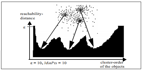
Illustrating the cluster-ordering by using a histogram as reachability plot is proposed in "OPTICS: Ordering Points To Identify the Clustering Structure". Clusters are represented by "valleys" in the histogram; Subclusters are valleys in valleys. Not only does this visualization provide a easily human readable format for cluster-ordering and hierarchy it is also connected to the inner workings of the OPTICS algorithm. Users who are used to working with the OPTICS algorithm can draw conclusions on how to adjust the starting parameters by looking at this histogram.
Interactively assigning a new ε' smaller than the original ε by dragging a slider allows the User to discover all density-based clustering results. Moving the slider further down splits big clusters into their subclusters. For a meaningful visualizations this has to be linked with other graphs- most commonly with the Clustering result in a 2D euclidean space (Graph 1.)
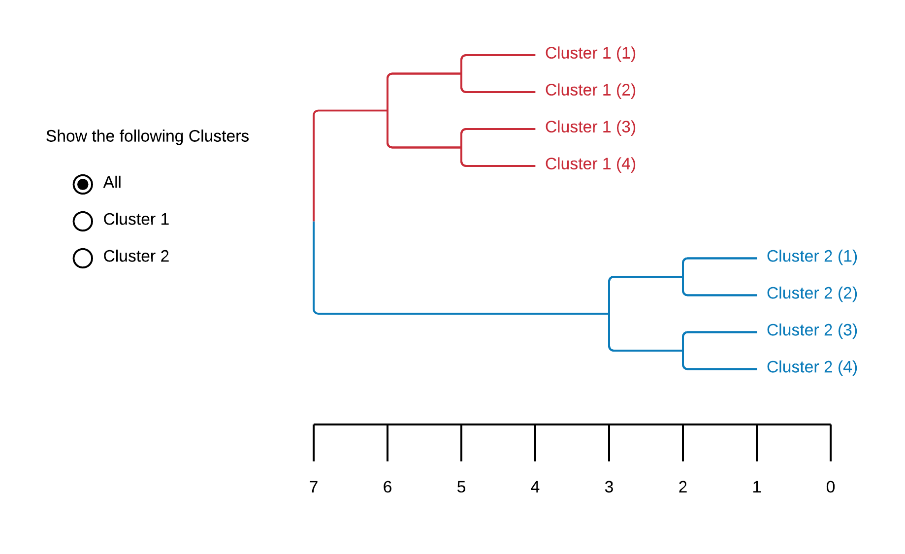
Dendrograms are tree diagrams to illustrate clusters produced by hierarchical clustering. A distance axis allows the User to see when a certain datapoint "joins" a cluster. It's similarity to genealogy illustrations (cladograms) makes it easy to interpret even when the meaning of this distance axis unknown to the User. That a possible interpretation of the distance axis isn't intuitiv is also it's biggest drawback.
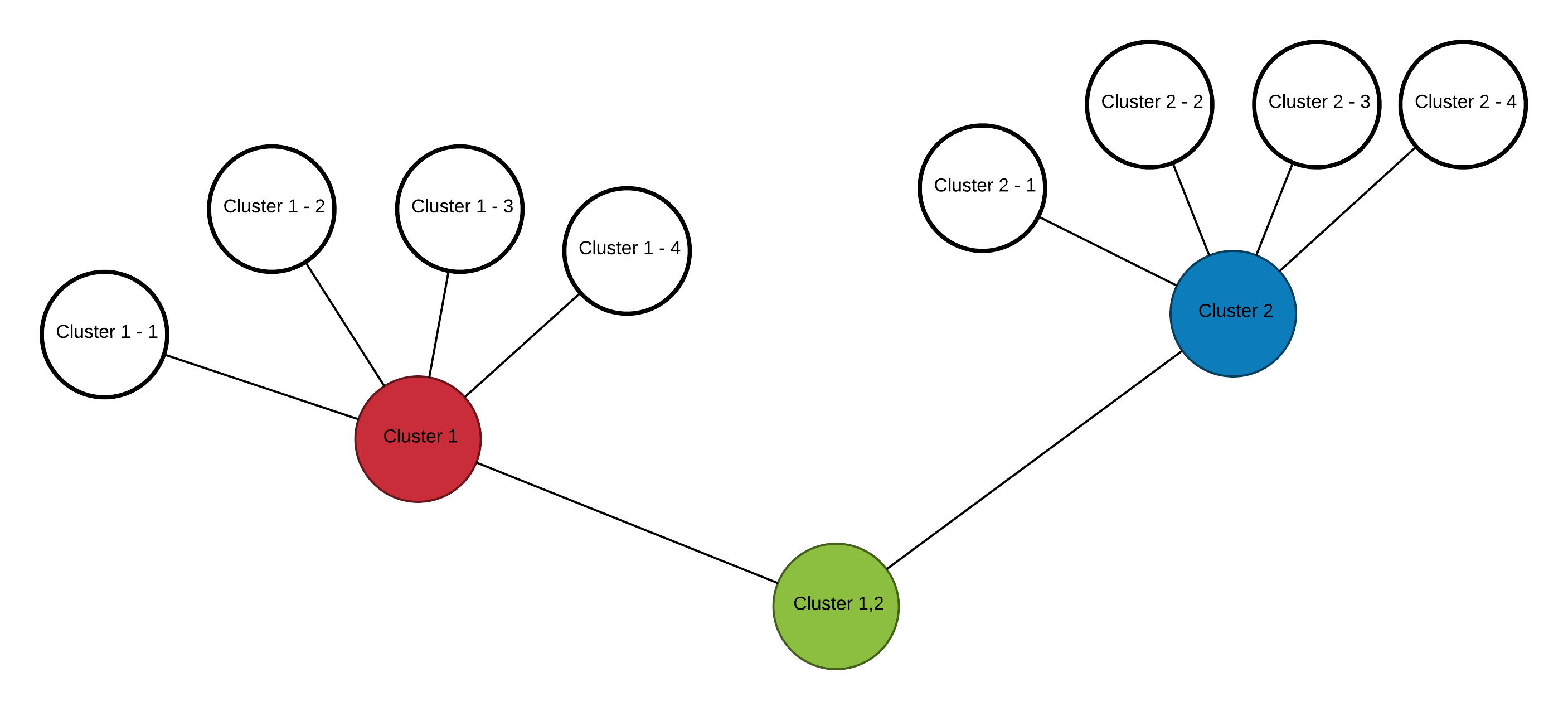
Results of hierarchical clustering can also be visualized as graphs. Nodes represent Clusters, which are made up of several sub-Nodes/-Clusters. This form of illustration is easily understandable without explanation or introduction. On the downside it holds very little information and its main advantage is in organizing a huge number subclusters.
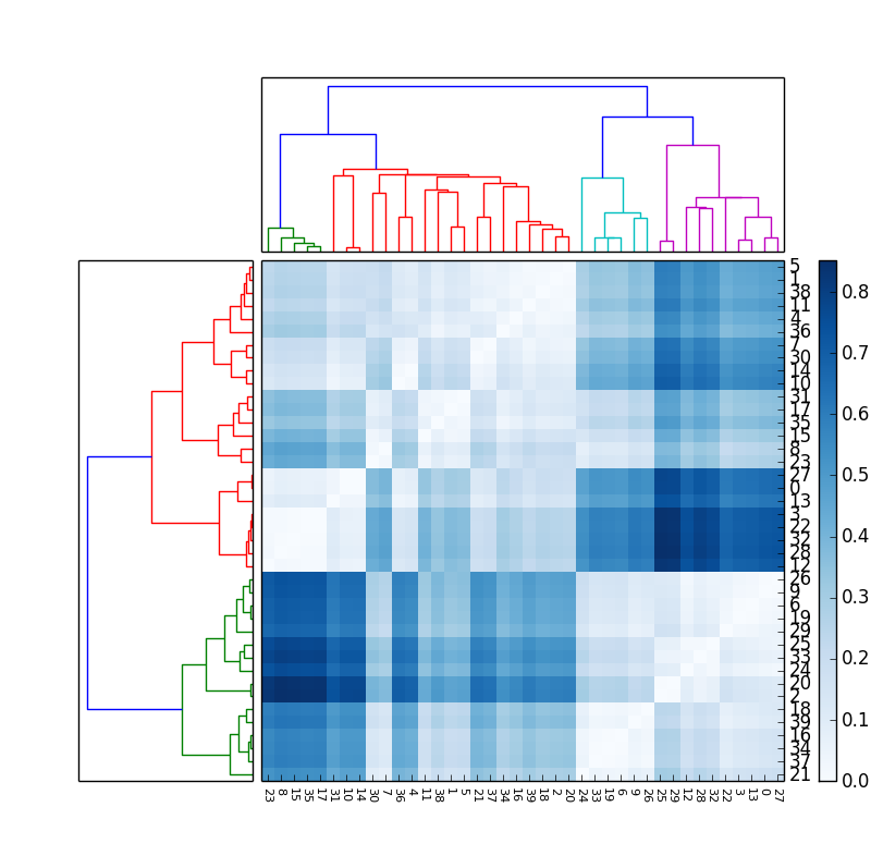
For datasets represented by a matrix of values it can be insightful to cluster columns and rows separated from each other. Combining the resulting dendrogram with a heatmap enables a User to look for associations between columns and rows by identifying patterns in the heatmap - often rectangular areas which share a color.
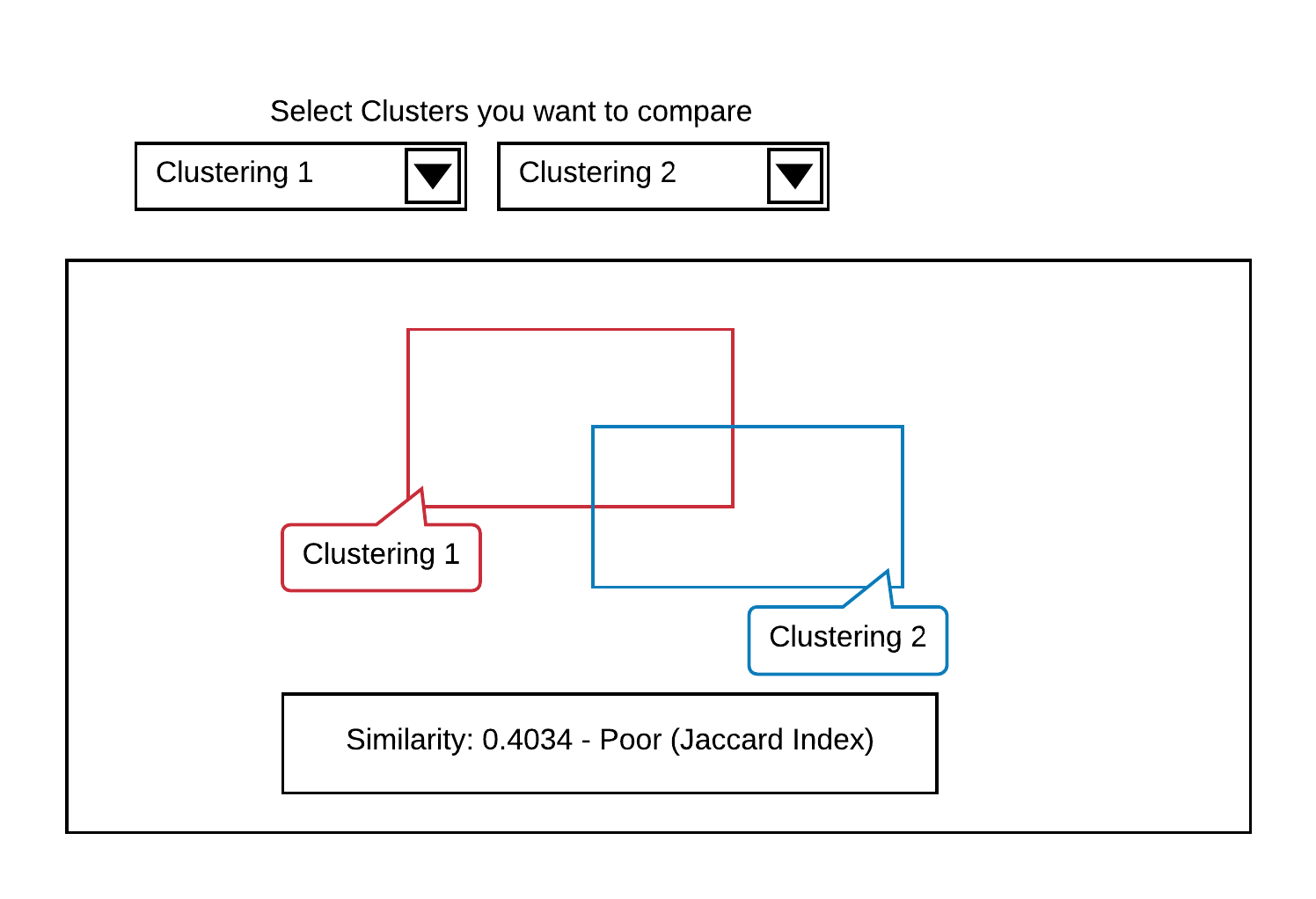
When performing different clustering operations - possibly even by using different clustering algorithms - on the same dataset it is necessary to compare those results for similar information. The Jaccard similarity coefficient is often visualized by illustrating results as overlapping forms. The relationship between the area of overlap and the area of union can be interpreted as similarity between two clustering results. While easy to understand and interpret those visualizations can only communicate a limited amount of information and basically visualize a single coefficient between 0 and 1.
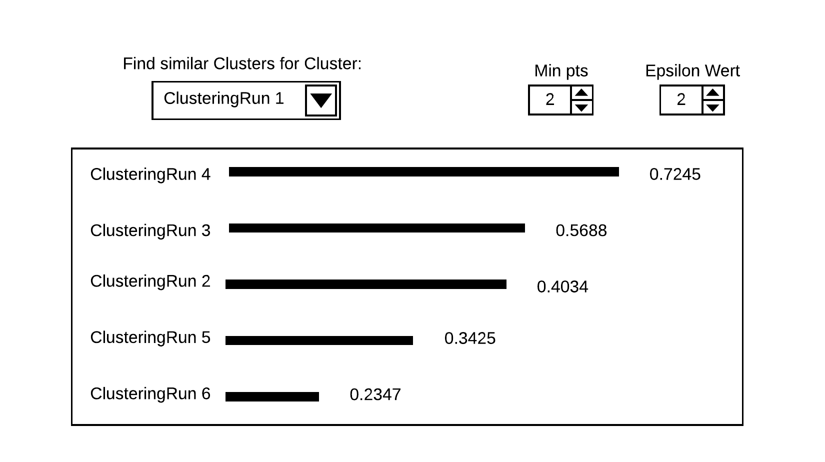
A simple barchart showing similarity coefficents for several algorithms runs compared to one specific clustering result gives a fast to grasp visualization of the similarity to a high number of other results and not just one. Still it's not possible to show similarity relationships between all results with each other, but the information density is greatly improved compared to Graph. 8.
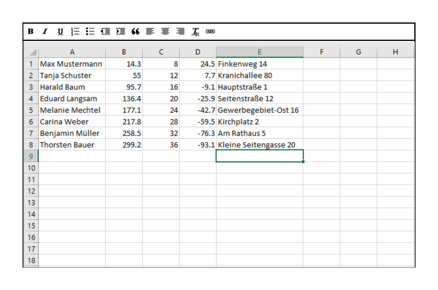
The most basic and common representation of datasets provided by Users are in the form of simple tables. Not only is it possible to provide multidimensional feature vectors like this. Many real world data is gathered or stored in form of comma seperated values. Most Users are already familiar with this format represented like this because of the widespread use of Spreadsheet software.
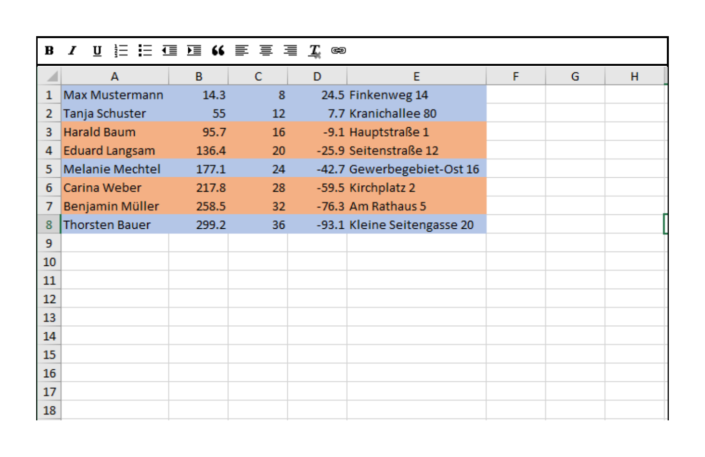
Ideally the clustering result could be used to sort or at least visually encode the detailed spreadsheet view. Possible comfort feature include to extract dendrogram- or clusterlables from this view to be used in other graphs.
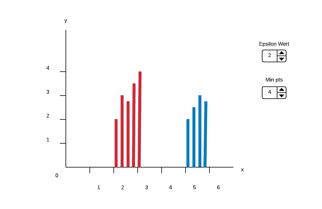
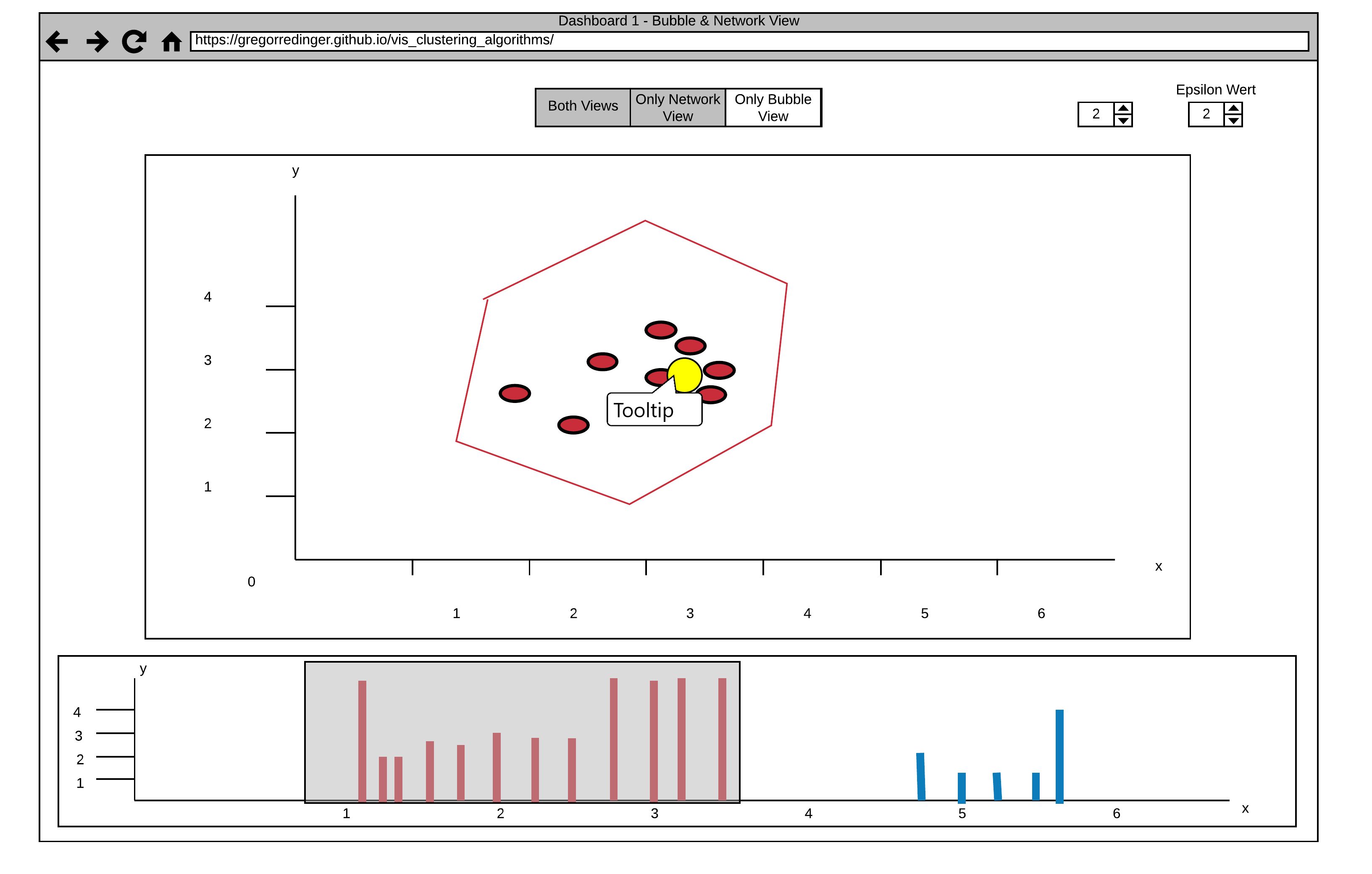
This Dashboard consists of three Views. The Histogram View on the Bottom of the Page shows a Reachability-plot. This is a 2D plot, with the ordering of the points on the x-Axis and the reachability distance on the y-Axis. Because points belonging to a cluster have a low reachability distance to their nearest neighbor, the clusters show up as valleys in the reachability plot.
The Bubble and the Network View provide a better Overview for the Distribution of the Clusters.
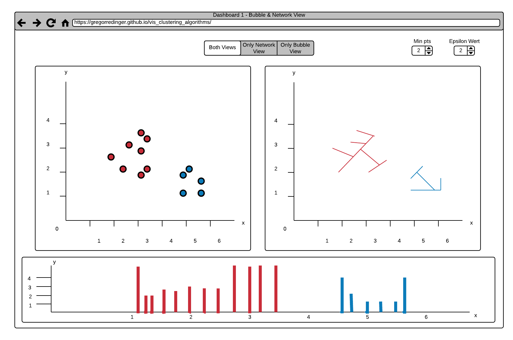
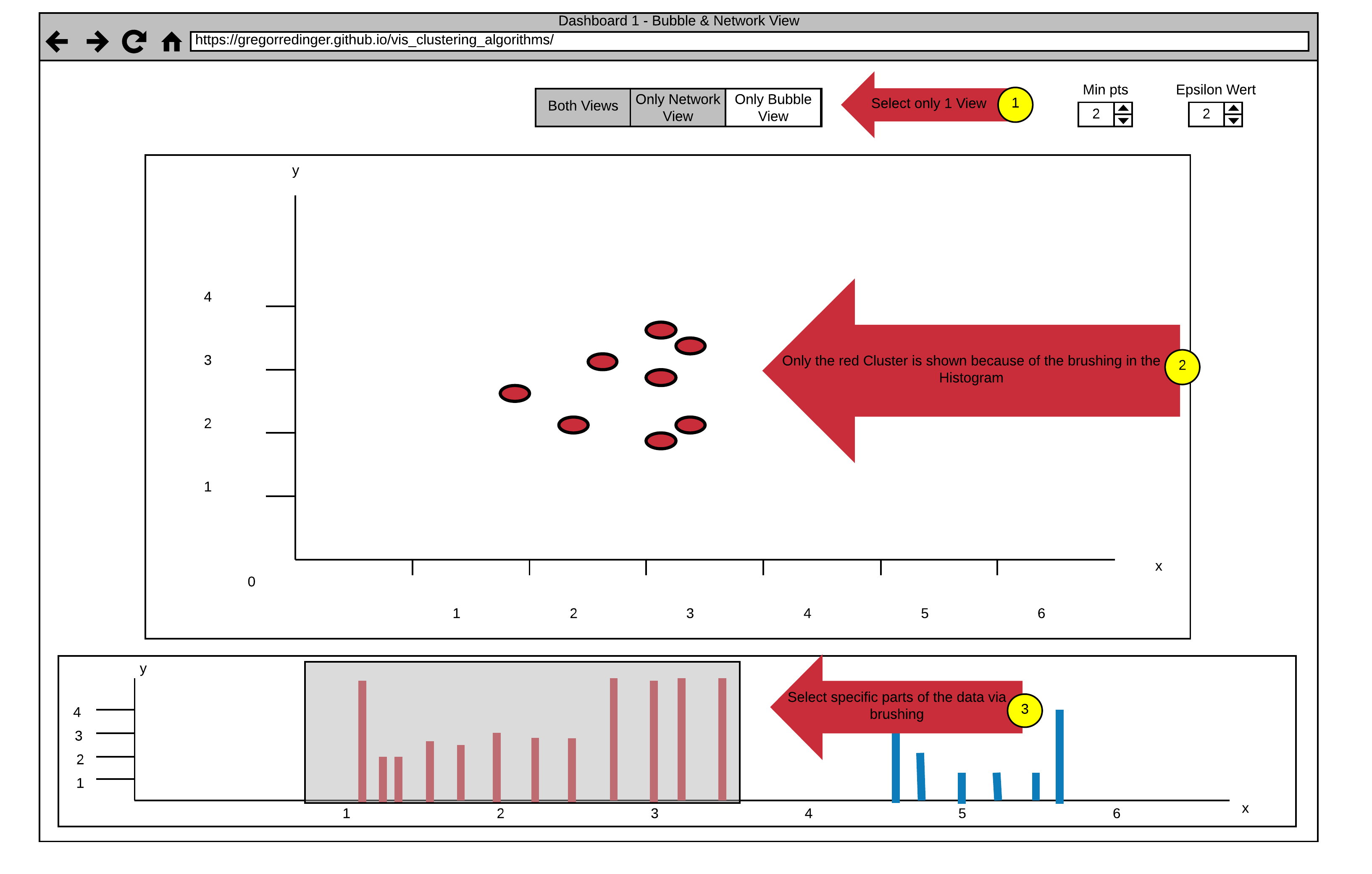
The Default Setting shows the Bubble and the Network View side by side, but it's also possible to enlarge one of the Views and hide the other. This can be done by using the View Choosing Buttons on the Top of the Page (see Arrow 1).
Another Interaction is to select specific Data in the Histogram via Brushing (see Arrow 3). The Data in the Bubble or Network View gets updated accordingly (see Arrow 2). This interaction allows a fine-grained Analysis of the Data.
It's also possible to adjust the two Parameters of the Optics Algorithm. Nearby Arrow 1 are two numerical Steppers to adjust the Parameters "Min pts" and "Epsilon". The Epsilon Value is used to set a maximal Distance to limit the Complexity of the Algorithm. The "Min pts" Value describes the number of Points required to form a Cluster.
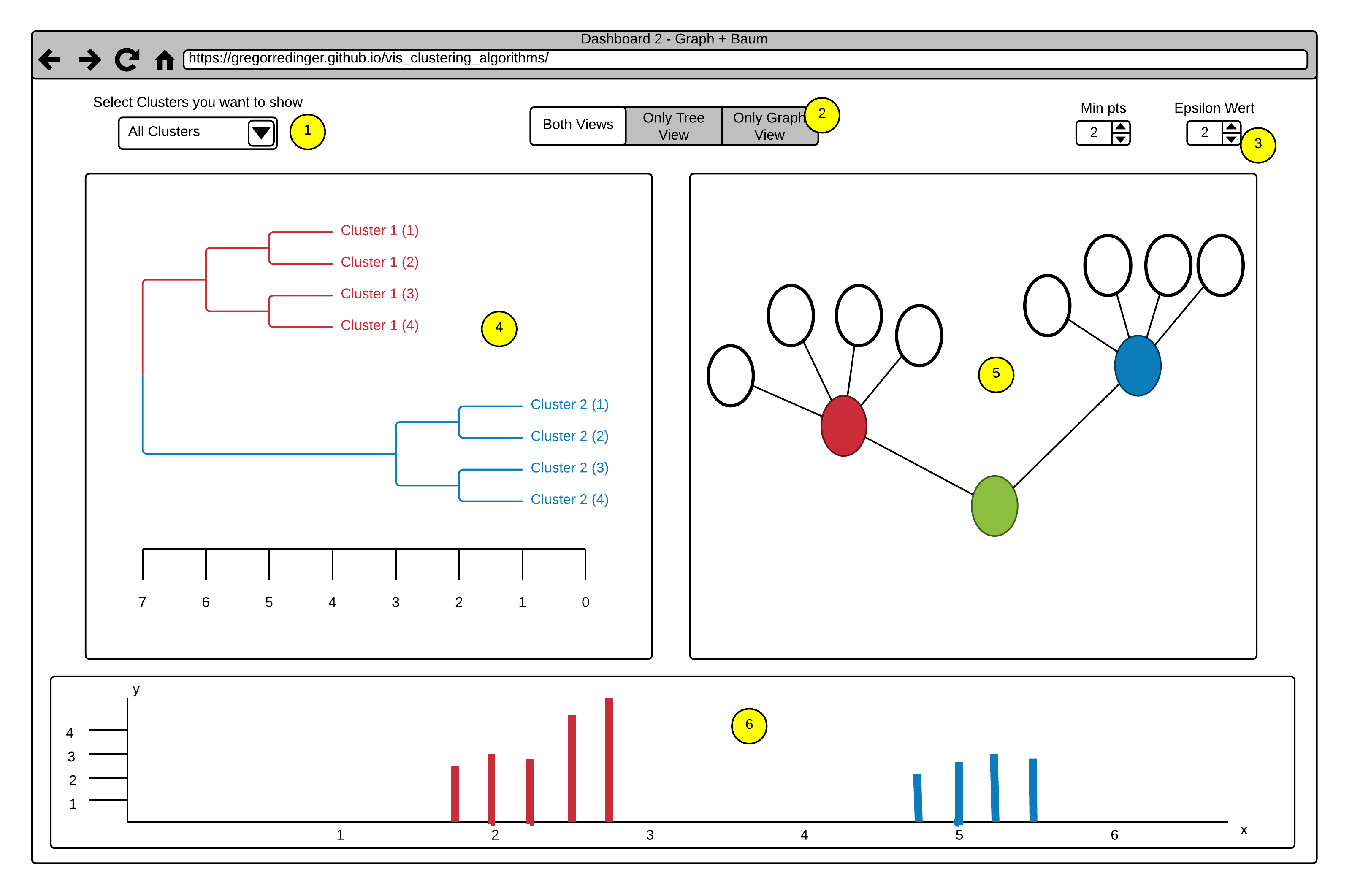
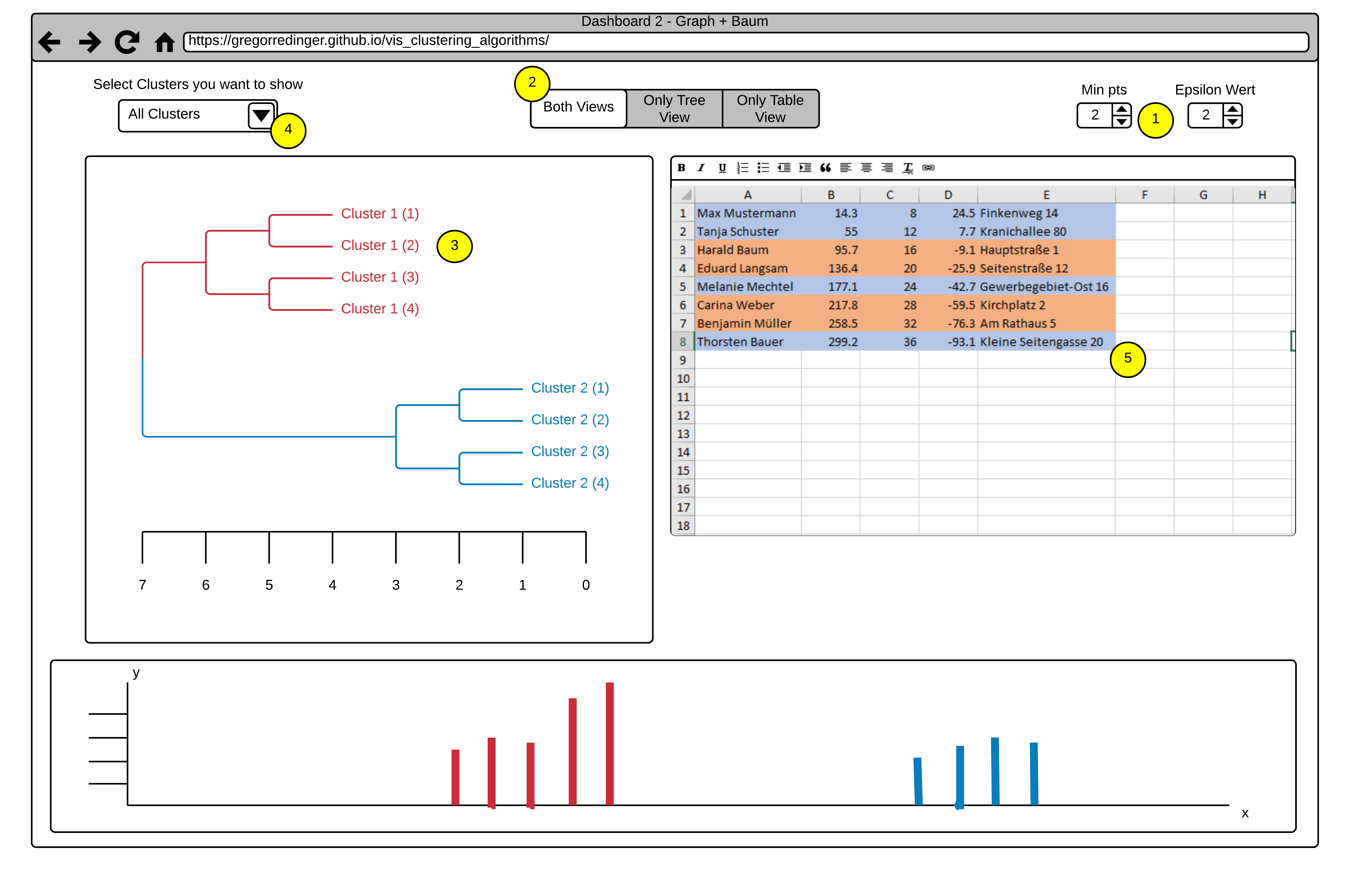
This Dashboard also consists of three Views.
The Histogram View (Point 6) with the same Brushing Functionality as in Dashboard 1.
A Tree Map View (Point 4).
And a Graph View (Point 5).
The Option to adjust different Views (Point 2) and the numerical Steppers to adjust the Parameters of the Algorithm also stays the same as in Dashboard 1.
A new Functionality in this Dashboard is the Option to select whole Clusters to show or hide via a dropdown Menu (Point 1). This Functionality allows a finer selection
in the Histogram View by excluding all points of a Cluster.
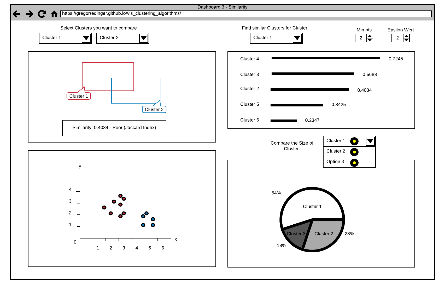
The first View in this Dashboard (see Point 1) offers a comparison Function between two Clusters. The Clusters can be selected via two Dropdown Menus, that shows a list of all Clusters. The View shows the Similarity as a Number and as two Rectangles. The more the Rectangles are Overlapping, the higher is the Similarity between the selected Clusters. This Information is also displayed as a Number on the bottom of the View. The Value that Indicates the Similarity ranges from 0 (totally different) to 1 (the same), we decided to point this out by classify the Number with (Poor, Good, Excellent).
The second View (see Point 2) offers a Search Function for similar Clusters. The User can select a Cluster via a Dropdown Menu and the View shows a List of all Clusters in descending order by their Similarity to the selected Cluster. The Similarity is expressed by the Length of a Line and the Value of the Similarity Index. We also plan to add a Tooltip to this Index Value, that explains it's meaning in more detail.
The third View (see Point 5) shows an Overview of the Clusters in a Coordinate System. Different Clusters have different Colors.
The fourth View (see Point 4) shows a Comparison between the Cluster Sizes as a Cake Diagram. The User can select the Clusters he want to compare via a Dropdown Menu (Selection of multiple or all Clusters is possible). This allows the User to get a fast Overview of the Cluster Sizes. We also think about a Selection Function in the third View that allows the Selection of specific Parts of a Cluster and shows the Distribution in the Cake Diagram.
He imports his List as csv File and adjust the Epsilon and Minpts Parameters. At first he struggled a bit with the Meaning of this Variables, but by hovering over them a tooltip with a detailed explanation pops up. Then he decided that he just need the bubble View and enlarge this View by clicking on the View Selector Button on the top of the Page. After the Application draw all Points on the View, he realized that there are only few, but big Clusters on the Map. It seems that the clusters divide students in bad, average and good performing students. So he select specific Clusters by brushing over the Histogram, which results in a clearer and easier to read View of the better perfoming students. By adjusting the ε' slider he realizes that this cluster is made up of two subclusters.
In the Spreadsheet View the original name column with from his score spreadsheet is still accessible, but all the students are marked in the corresponding color of subclusters he selected by combining brushing and the ε' slider. After recognizing some names in each of the clusters Prof. Snow thinks that his good performing students are divided into full-time students and students who work part time in an IT-related field. He switches back to the bubble view and tries to find more clusters. Possible one or more with students who work in other fields.
Frank, the Owner of a local Grocery Store wants to offer his Customers the Option of a 10 Minute Delivery, to compete with Amazon Fresh, that started recently in his City. Because a 10 Minute Delivery is not possible in the whole City, he plan to restrict his Offer to a specific Street. He also thinks that only People with a relatively high Income are willing to pay the Delivery Fee, so he want to limit his Marketing to these Kind of People. Thankfully he had a List with the Income and the Residence of all People of his City as Csv. The Problem is to evaluate the List by himself would take way too much time, so he decided to use our Application instead.

At first he imports his List Data in our Application and adjust the Epsilon and Minpts Parameters. Like the Doctor before, the Tooltip Explanation help him to find the correct Settings. He decided to stick with the default View Settings that shows them Side by Side, because he need both. After analyzing the Tree View (Point 3), he decided to remove all Clusters with a low Income. He only select the Clusters with high Income over a Dropdown Menu (Point 4). The View updates and show the desired Results. Now he searches in the Table View (Point 5) after all Entries with the Street, where he plan to offer his Delivery Service. Because the Table View only Shows the Results of the selected Cluster, he can complete his search in no time.
Mihael Ankerst, Markus M. Breunig, Hans-Peter Kriegel, Jörg Sander (1999). OPTICS: Ordering Points To Identify the Clustering Structure. ACM SIGMOD international conference on Management of data. ACM Press. pp. 49–60.
Leskovec, J., Rajaraman, A., & Ullman, J. D. (2014). Mining of massive datasets. Cambridge university press.
Lucidchart. Online-Software für die Erstellung von Flussdiagrammen & Grafiken jeder Art. (2017, October 26). Retrieved November 20, 2017, from https://www.lucidchart.com/pages/de
052813 VU Scientific Data Management (2017S) - Course Material
We will use Javascript as our Programming Language. We think its a good choice because there are many libraries and tools for building web Applications in this Language.
We will use Babel as a Preprocessor for our Js Code. This allows us to use ES6 Features(import/export, for of loops,...) and ensures that our Code will run in older Browser too.
We will use Webpack as Module Bundler. So we can structure our Code in a clean way by modularize it. Webpack will then take care of stitching together all this modules (and their dependencies) into a single file in the correct order.
Since D3 is the De-Facto-Standard for building Diagrams in Javascript, we decided to use it as our Tool of Choice.
To Document our Code we will use Jsdoc because it's very similar to Javadoc, a tool we already gained a lot of Experience with.
To manage our Dependencies we will use the node package manager. We think this is a good choice because it's much easier to manage all our Dependencies in one Place. Npm will also take care of updating our Packages and warn us about deprecated Packages.
On the Server Side we will use node in Combination with express as Server. This Combination is very common and powerful for creating APIs. It's also a benefit that we can manage our Dependencies with npm on Client- and Server-side.
As IDE we use Webstorm because it's especially designed for Web Development and very reliable and powerful.
Requirements for M3 providing minimal functionality
Additional Requirements for M3/M4 resulting from this proposal